Design Styles001: Minimalism
Design Styles 001: Minimalism
- Written by
- Aubin
- Published
- 19 Sept 2026
- Reading time
- 6 min
- Filed under
- Journal
In this entry · 6 sections
DESIGN STYLES
001 - MINIMALISM
One style. Two very different interpretations.
Minimalism has become one of the most recognizable approaches in contemporary design.
It appears everywhere; from technology and architecture to fashion, interiors, packaging, websites, and brand identities. The visual language is familiar: simple forms, restrained color palettes, clean typography, generous whitespace, and very little decoration.
But minimalism is often misunderstood.
It isn't simply about making things look clean. It isn't about putting a logo on a white background and calling it sophisticated. And it certainly doesn't mean every minimalist brand should look the same.
Minimalism is ultimately about intentionality.
It's about deciding what is essential, removing what isn't, and giving the things that remain enough space and purpose to communicate.
To explore that idea, we imagined two very different brands using the same design style.
01 / TWO BRANDS, ONE STARTING POINT
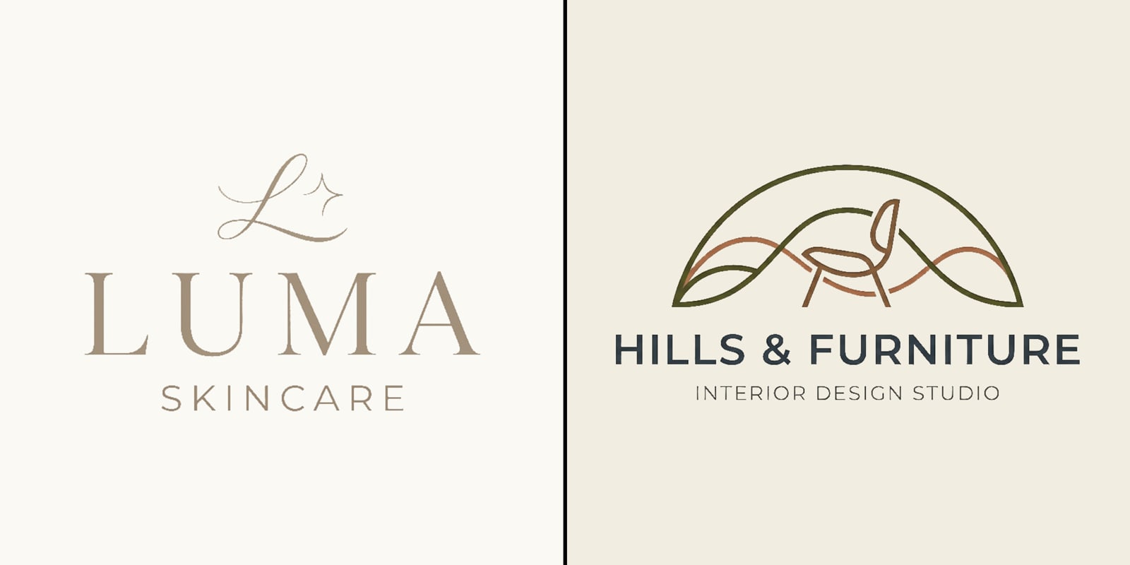
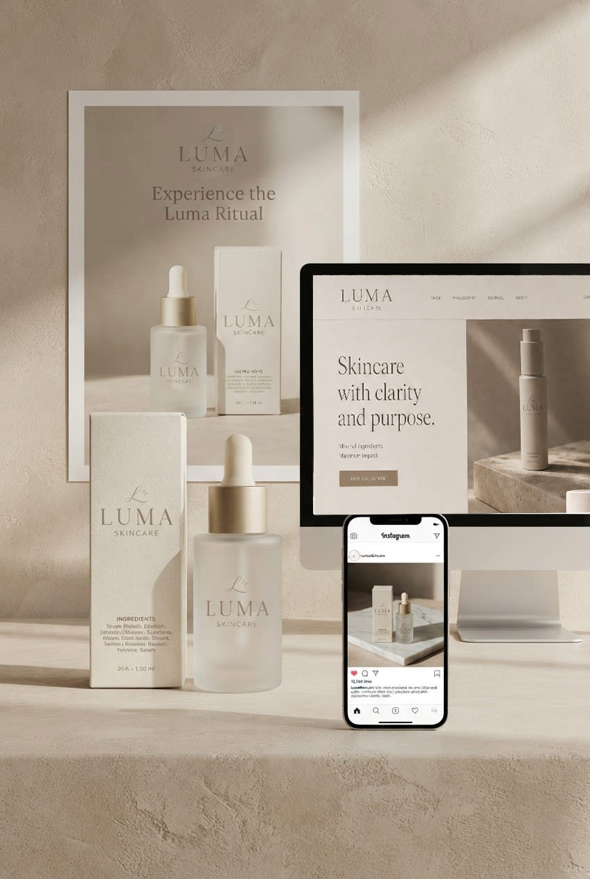
The first is Luma, a contemporary skincare brand built around simplicity, precision, and considered products.
Its audience is looking for skincare that feels trustworthy, modern, and uncomplicated. Luma doesn't need to overwhelm people with information or visual noise. Its identity needs to communicate clarity and quality almost immediately.
The second is Hills & Furniture, a fictional Kigali-based interior design studio creating sophisticated residential and commercial spaces.
The studio is defined by thoughtful spatial design, carefully selected furniture, natural materials, strong proportions, and understated luxury.
Its brand needs to communicate the same qualities as its work: elegance, confidence, craftsmanship, and a strong sense of taste — without competing with the spaces it creates.
Both brands can benefit from minimalism.
But they don't need the same kind of minimalism.
That distinction is important.
A design style should never be chosen simply because it looks good. It should be considered in relation to what the brand needs to communicate.
02 / WHAT DOES MINIMALISM MEAN FOR EACH BRAND?
For Luma, minimalism is primarily about clarity and precision.
The products need room to breathe. Information needs to be easy to understand. The visual system should feel controlled rather than expressive for the sake of expression.
A restrained palette, clean typography, carefully composed photography, and generous spacing allow the products themselves to become the focus.
The result should feel calm and considered.
For Hills & Furniture, minimalism serves a different purpose.
Here, it is about elegance, materiality, and restraint.
An interior design studio doesn't necessarily need elaborate graphics or traditional signals of luxury. The feeling of quality can come from the things the studio already values: proportion, materials, architecture, furniture, light, and space.
The identity should create room for those elements to speak.
Typography can feel sophisticated without becoming decorative. Photography can focus on materials and finished spaces. Layouts can be spacious enough to let individual projects feel important.
The brand becomes an extension of the spaces it creates.
This is one of the reasons minimalism is more than an aesthetic.
There isn't one “minimalist look.”
There are minimalist decisions.
03 / DEFINING THE VISUAL LANGUAGE
Once the role of minimalism is understood, the visual language starts to become much more specific.
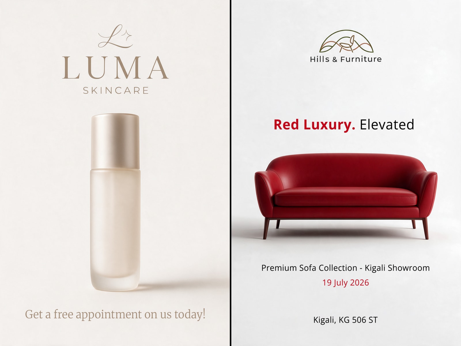
For Luma, that could mean soft neutral colors, structured typography, generous spacing, and product photography that feels clean and controlled.
Everything has a purpose.
The packaging doesn't need unnecessary decoration. The website doesn't need excessive interaction. Social media doesn't need to constantly compete for attention.
The identity creates a quiet environment around the product.

For Hills & Furniture, the same restraint can become warmer and more architectural.
Its palette might move toward ivory, stone, taupe, walnut, and muted charcoal. Typography can be refined and editorial. Photography can focus on beautiful interiors, carefully selected furniture, natural materials, and the relationship between light and space.
Instead of relying on decorative graphics, the brand's personality comes through composition, proportion, materials, and photography.
An architectural detail can become part of the identity.
A material texture can become a visual device.
A beautifully framed interior can communicate more than a page full of graphics ever could.
The brand doesn't need to tell you that its work is luxurious.
The visual experience should make that feeling apparent.
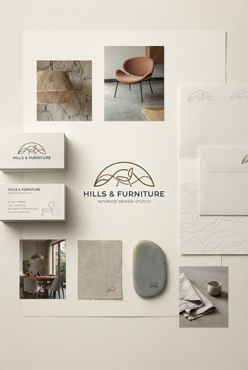
Both identities are minimal.
They simply speak different languages.
04 / FROM IDENTITY TO EXPERIENCE
A strong identity shouldn't only work when it's placed next to a logo.
It needs to survive contact with the real world.
For Luma, that might mean carrying the same visual language across product packaging, an e-commerce website, social media, advertising, and printed materials.
The same sense of calm and precision should remain present whether you're holding the product, browsing the website, or seeing the brand on your feed.
For Hills & Furniture, the experience begins with the spaces themselves.
The brand might appear across a website showcasing completed projects, a beautifully designed project presentation, social media, architectural photography, proposals, material samples, signage, and printed collateral.
Each touchpoint should feel like part of the same world.
The website should give the studio's projects enough space to be appreciated. A project presentation should feel considered rather than overloaded. Social content should allow materials, furniture, architecture, and details to carry the visual story.
Even a simple studio sign can communicate the same restraint.
The identity doesn't need to compete with the interiors.
It creates an environment where the work can speak.

This is where a visual style becomes a system.
It's no longer just about how the brand looks.
It's about how the brand behaves.
05 / THE DANGER OF “MINIMALIST”
The popularity of minimalism has created an interesting problem.
The more brands adopt the same visual language, the easier it becomes for minimalism to become generic.
Neutral colors. Thin typography. Lots of whitespace. Simple logos. Beautiful photography.
All of these things can be effective.
But when they're used without a clear reason, they can make completely different brands start to look interchangeable.
A skincare company can end up looking like an architecture studio.
An interior design studio can end up looking like a technology company.
And suddenly, removing everything unnecessary has also removed everything distinctive.
That's the paradox of minimalism.
The goal isn't to remove personality.
The goal is to remove everything that gets in the way of it.
For Luma, that personality might come through precision and clarity.
For Hills & Furniture, it might come through warmth, materiality, architecture, and quiet luxury.
The difference isn't necessarily in how much each brand has.
It's in what each brand chooses to keep.
06 / WHAT THE TWO BRANDS TEACH US
Luma and Hills & Furniture started with the same design style.
They ended up somewhere very different.
Luma uses minimalism to create clarity.
Hills & Furniture uses it to create an atmosphere of elegance, warmth, and restraint.
Neither needs to abandon minimalism to become distinctive. They simply interpret it through the needs of their own brands.
And that's the bigger lesson.
Design styles are not templates.
They are tools.
Minimalism can be quiet or bold. Warm or clinical. Soft or architectural. Premium or accessible.
The style doesn't define the brand.
The brand defines how the style is used.
At evolu, that's where we believe design starts — not with a style, but with an understanding of the brand.
The audience.
The personality.
The positioning.
The ambition.
The style comes afterwards.
Minimalism might be the answer.
Sometimes it won't be.
And that's exactly why it's worth studying.