Why It Works001: Apple
Why Apple Works
- Written by
- Aubin
- Published
- 24 Sept 2026
- Reading time
- 7 min
- Filed under
- Journal
In this entry · 7 sections
WHY IT WORKS / 001
Apple
How Apple turned a company into a brand people recognize without seeing the logo.
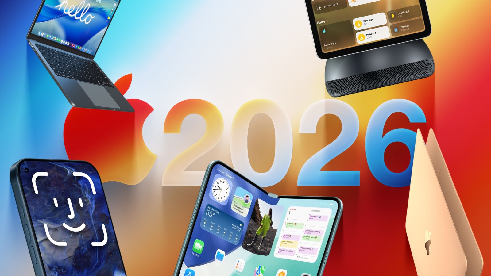
As you’re reading this, the iPhone 18 Pro and the trending new foldable iPhone 18 Duo are already in stores.
The latest Apple Watch has just arrived. New AirPods are on shelves. Apple is once again at the center of conversations about its products, design, technology, and what comes next. On September 18, Apple officially brought its latest Pro iPhones and new Apple Watch and AirPods lineups to stores worldwide.
And yet, for a brand that releases new products almost every year, the interesting part isn't really the products themselves.
It's how Apple makes people care about them.
A new iPhone isn't simply introduced as another smartphone entering an already crowded market. Its arrival becomes an event. People anticipate it. They discuss it. They speculate about it. They recognize it before they've even seen the logo.
That's branding.
Apple is one of the clearest examples of what happens when a company builds much more than a visual identity. Its history, products, advertising, presentations, retail spaces, software, packaging, and even the way it reveals information all contribute to one recognizable world.
In 2026, as Apple marks 50 years since its founding in 1976, its history gives us an unusually long view of how that world was built.
So rather than asking “Why is Apple so successful?”, we're asking something more useful:
Why does Apple feel like Apple?
And what can other brands learn from that?
01 / A BRAND IS BUILT OVER TIME

Apple had its 50 year anniversary in 2026. But, it didn't start as the highly controlled, premium brand we know today.
Its visual identity evolved. Its products evolved. Its advertising evolved. Its leadership changed. Its position in culture changed.
The company went from the Apple II and Macintosh to the iPod, iPhone, iPad, Apple Watch, Vision Pro, and a growing collection of services. Each era brought a different expression of the brand.

But underneath those changes, certain ideas kept returning.
Simplicity.
Creativity.
"Thinking Different".
Making complex technology feel more approachable.
This is an important distinction.
A strong brand doesn't necessarily stay visually identical forever.
It keeps its core idea while allowing its expression to evolve.
That's something businesses often get wrong.
They think consistency means keeping the same logo, colors, and fonts forever.
It doesn't.
Consistency is about making sure that, even as the brand changes, people can still recognize what it stands for.
02 / APPLE DIDN'T JUST SELL PRODUCTS
One of Apple's most important branding decisions was moving beyond the question:
“What are we selling?”
And toward:
“What do we represent?”
The clearest example is Think Different.

The campaign arrived in 1997, around the time Steve Jobs returned to Apple, and positioned the company around creativity, individuality, and people who challenged convention rather than simply promoting computer specifications. The campaign became an important part of Apple's repositioning.
That distinction matters.
A computer company can tell you how much storage its computer has.
A brand can tell you why that computer belongs in your life.
Apple increasingly became associated with a particular point of view.
And that's one of the biggest opportunities in branding:
Your product tells people what you sell.
Your brand tells people why it matters.
03 / THE LOGO IS NOT THE BRAND

This might be the simplest lesson Apple gives us.
The apple symbol is incredibly recognizable.
But the symbol alone isn't responsible for that recognition.
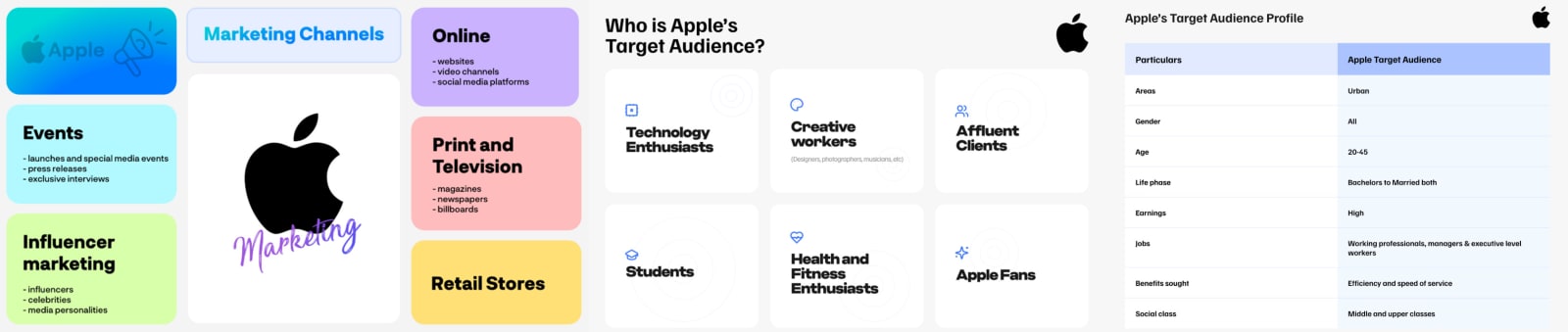
It exists within a much larger system.
Product design, Photography, Typography, Packaging, Retail, Advertising, Motion, Sound, Interface design, Copywriting, etc...
Every one of these elements contributes to the same overall perception.
This is why a brand identity shouldn't be approached as a logo project.
A logo is one asset.
A brand is the system surrounding it.
The strongest identities are recognizable through their behavior, not just their symbol.
Apple can change the product.
It can change the interface.
It can change the advertising.
It can change the visual language.
And the brand can still feel like Apple.
That's what a real identity system is designed to achieve.
04 / THE POWER OF MYSTERY

For much of Apple's history, secrecy wasn't just an internal habit.
It became part of the brand experience.
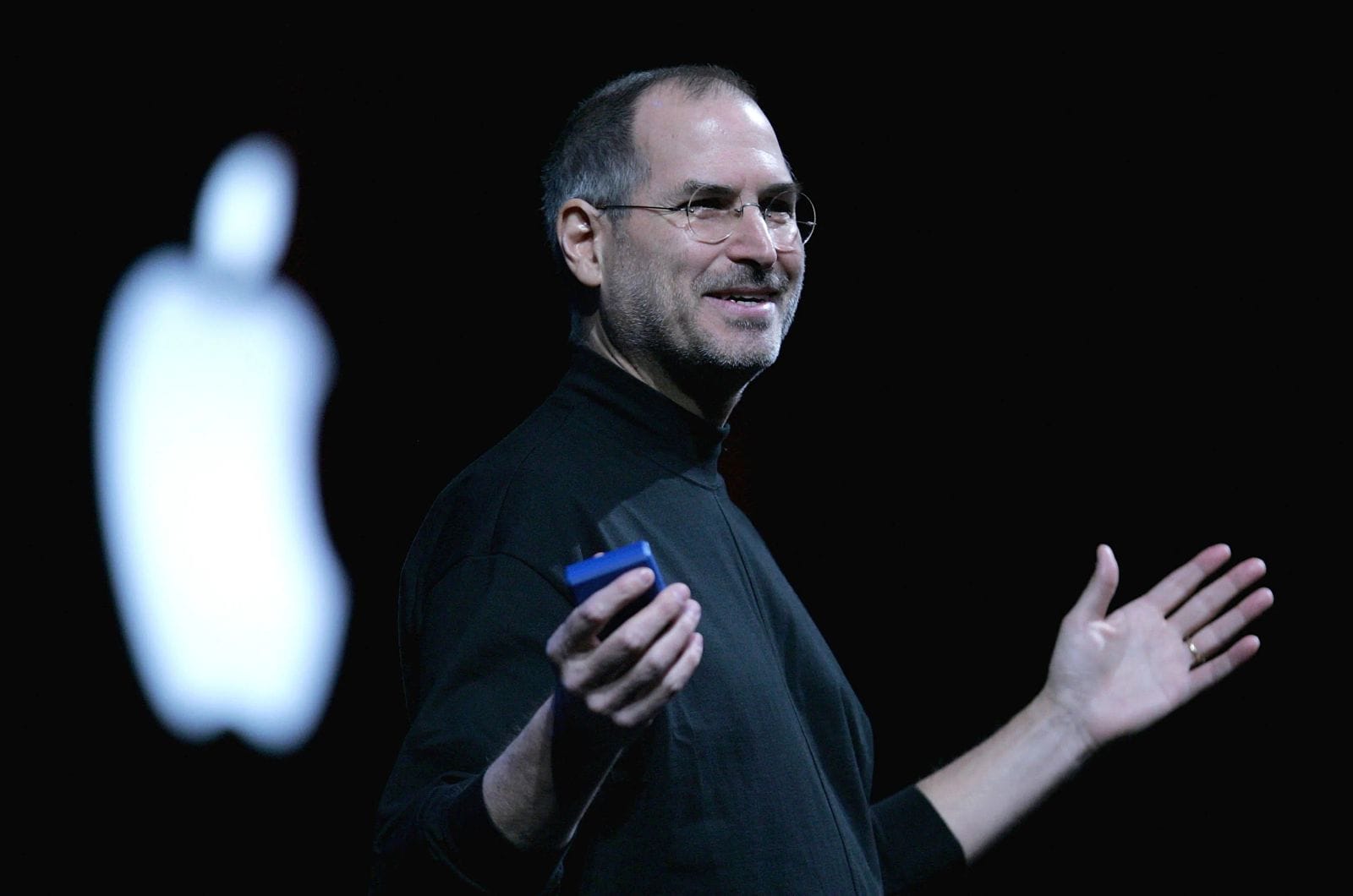
Before major product announcements, Apple was known for revealing very little. Invitations could deliberately withhold the details of the event, creating speculation and discussion before the product was even shown. Steve Jobs became particularly associated with theatrical reveals and the anticipation surrounding them.
Why did that work?
Because Apple understood something fundamental about attention:
People are more interested in discovering something than being told everything about it upfront.
The reveal became an experience.
The audience speculated.
The media speculated.
Fans speculated.
Then Apple controlled the moment when the story became official.
In other words, the launch itself became part of the branding.
This is particularly interesting because Apple's relationship with secrecy has changed over time.
The modern technology industry makes complete secrecy much harder. Products move through enormous supply chains, software is previewed, developers get early access, and information spreads almost instantly.
Apple still controls its announcements carefully, but today's brand is more open in many areas than the highly secretive culture associated with the Jobs era.
And that's actually the more useful lesson.
The takeaway isn't:
“Your business should be secretive.”
It's:
“Your brand should be intentional about what it reveals, when it reveals it, and how it creates anticipation.”
Mystery is a tactic.
The strategy is controlling the story.

05 / CONSISTENCY DOESN'T MEAN STAYING THE SAME
Apple is a useful example of something that sounds contradictory:
A brand can evolve while remaining recognizable.
Its products don't look the same as they did twenty, ten, or even five years ago.
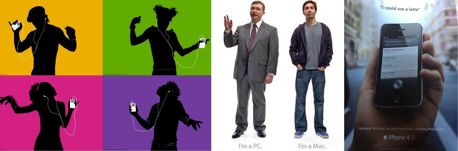
Its advertising has changed.
Its interfaces have changed.
Its typography has changed.
Its technology has changed.
Yet there is still a recognizable Apple-ness to the experience.
That comes from maintaining certain principles while changing the execution.
Apple's current software design is a good example.
In 2025, Apple introduced Liquid Glass, a new translucent and dynamic design language across its major platforms. Apple described it as a way to create greater harmony across its ecosystem while preserving the distinct qualities of each platform.
In 2026, Apple continued refining the system, with updated guidance focused on consistency, readability, accessibility, and adaptation across devices and screen sizes.
The important part isn't whether Liquid Glass is better or worse than what came before it.
It's that Apple can introduce a significantly different visual language without abandoning the larger brand system.
That's what evolution should look like.
06 / EVERY TOUCHPOINT IS PART OF THE BRAND
A common branding mistake is to think of the identity as something that lives inside a brand guidelines PDF.
The logo looks right.
The colors are correct.
The typography is defined.
Done.
Apple demonstrates the opposite.
The brand exists wherever the customer interacts with the business.
A product page.
A box.
A physical store.
A keynote.
An operating system.
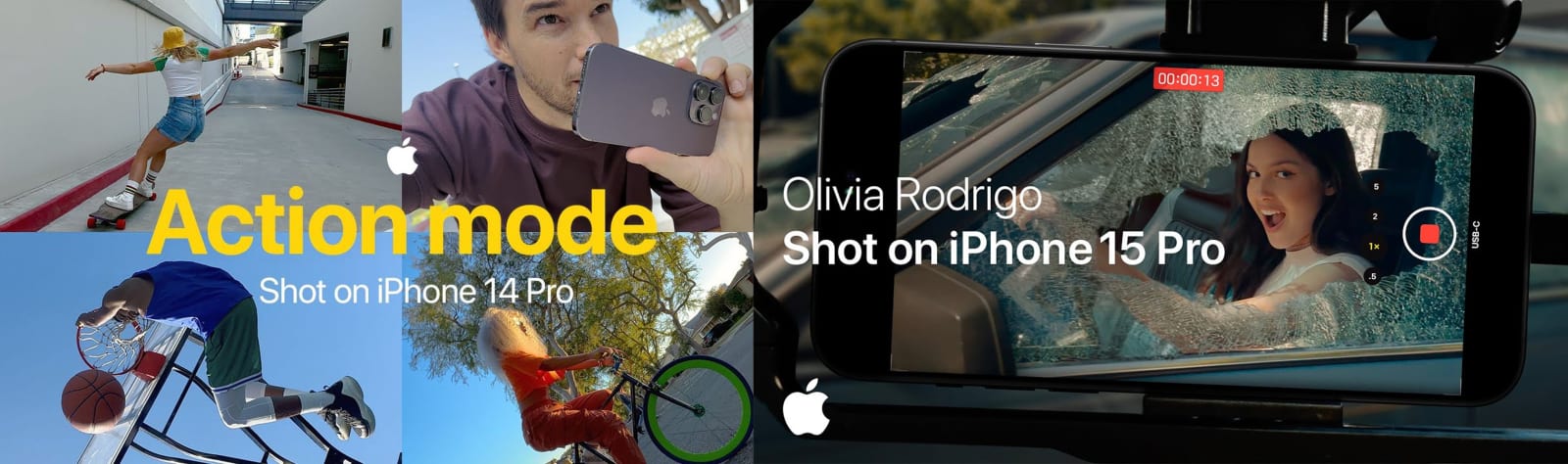
An advertisement.
A customer-support interaction.
A launch announcement.
Each one contributes to the same perception.
Apple's current design guidance explicitly emphasizes a unified design language across platforms while preserving the distinct qualities of each experience.
That's the difference between visual consistency and brand consistency.
Visual consistency asks:
Does everything look the same?
Brand consistency asks:
Does everything feel like it belongs to the same brand?
The second is much more important.


07 / WHAT APPLE ACTUALLY TEACHES US
Apple isn't a template.
A business doesn't become Apple by using minimalist typography, white space, black text, or carefully photographed products.
Those are expressions of Apple's particular brand.
The more valuable lesson is underneath them.
Apple knows what it wants to represent.
It has spent decades turning those ideas into a recognizable system.
Its history informs the brand.
Its products reinforce the brand.
Its communication reinforces the brand.
Its experiences reinforce the brand.
And when the visual language changes, it changes within that larger system.
That's why the brand can evolve without starting from zero.
For a business, that's the real opportunity of branding.
Not simply to create something that looks good today.
But to create something that can grow, adapt, and remain recognizable tomorrow.
Because ultimately, the strongest brands aren't recognized because people remember their logo.
They're recognized because people remember how the brand makes them feel, what it stands for, and what they can expect from it.
And that is why Apple works.
Not because of one design decision.
Because thousands of decisions keep telling the same story.